The Comic 4
Experience
What a silly name for this report ... ^^
Well, I'll discuss here some topics about the development of this comic, scanning, file
formats, and maybe page desingn, dunno ... I guess everybody will find it interesting, but
warning, if you haven't read Comic 4 yet, this section contains some comic scenes that
could spoil the fun ... I recommend to check the comic section
first.
First some records
As most know, Comic 4 is the conclusion of
the battle between Fire Man and Search Man started in Comic 3. There were more than 5
moths of difference between the launch of both issues ... and some visitors get mad for
that. The point is, I think the art improvement is more evident here than with the other
comics cause they have only a few months of difference. The reason is during those 5
months I wasn't just sudying and studying engineering. Well, I was very busy, but at least
I could ink Comic 1 and practice a lot on paper watching some anime. And I didn't want
limits on Comic 4. Most comic are intented to be short cause the inking is tedious ... but
the rule was totally broken with this 42 pages comic. This issue could be considered as 2
comics in one ... or 3 DBZ episodes? Oo.
I got vacations and started the comic
pencils at 19/Sept/99. The 42 pages were done at 25/Sept/99, something like 6 days later.
Ugh, that was fast. But think that I don't give too much details as shadows or such things
cause I was the one who went to ink the pages, so I knew what to do later without problem.
If someone else might ink my comics, I should almost render every shadow and every texture
in pencil, otherwhise, how the heck he would understand what I want or what I was thinking
during the drawing of each panel.
Later I started to ink the comic, go back
to studies, and it took me 53 days, until 23/Nov/99, to fully ink it. I don't know if that
was fast, but considering that I was in classes, well, maybe it was. After that, the
scanning and cover CG aren't so difficult. All was done and uploaded at 01/Dic/99
The lost details
Ok, I admit I'm obsessed with load time,
performance and file size efficience. That's why my comics are 2 B&W colors. That give
us smaller and quick loading files. And, of course, I can keep the image area BIG ^_^ But
what was lost? Let's see :
 |
 |
| 16 colors grayscale. |
2 color B&W |
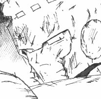
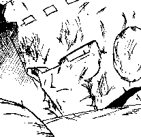
Again this topic? Ok, here we go. There is
a dilemma between quality and file size. Both are 100 dpi (dot per inch) not resampled
images. Left image is how the comic really should look. Cool rendering and cross lines
(great craks and dust =_0). There are no rough borders nor lost details. But the
file is 8.04 Kb. By the other hand, right image doesn't look so bad, but anyway it's not
perfect. Pixeled borders and soft lines lost are the cost of a 2.83 Kb file. That almost
gives us a 3 times file size relation. That maybe doesn't care here, but a web page filled
with images like the left one will take three times to load than a page filled with images
like the right one. Again it doesn't care with single not related images, but a comic, a
story that the reader is following, heck, it can be very upseting the delay time. Of
course, if you have a T1 connection, maybe this doesn't care again!! But I know most
visitors apreciate the faster loading time. ^_^ Furthermore, the complete set of images of
the 42 pages are around 2 Mb, and that's important on a free server account (and a
small HD). I don't expect every author doing this with their files. If I'm really
interested, I can spent hours waiting for an image to load ... ok, that was an
exaggeration :P
|
 |
 |
| 16 colors grayscale. |
2 color B&W |
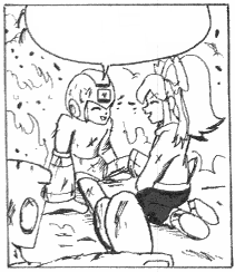
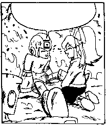
Here we have a new case. The smaller the
image, the hard to get all the details with a 100 dpi scan. The problem didn't appear in
big close up's as the first exmple, but here we can see how some little details on Roll's
face are lost in the right image and definitely make look her better in the left image. I
think the only way to fix this without increasing the colors is increasing the dpi's ...
maybe 200 or 300 dpi. But, heck, I'm not going to CG that image ... and if I made that,
the other panels will look too small (more dpi made image area bigger) ... You know ...
the page desing will be ruined O_o
Another thing to think about is, in spite that both images haven't straight edges, the
pixeled dust is more evident in the right image's borders than in the left one. Oo All
those little sacrifice are needed for a more enjoyable experience reading these comics.
Anyway, when the story is good, people is more worried about what happens in the next
panel and usually don't note those little errors. I got more flames for content than for
image quality ^^
|
About the Content

16 colors grayscale
60% resampled
|
Hey hey, what's this? DBZ? I guess
during those months I was very influenced for that anime ^^ ... Well, the fact is that I
wanted a really big fight ... a royal rumble or something ... so I just started, drew and
drew and "let's see how much long it gets". I had clear in my mind some
of the important moments as Fire Man stopping the attack against Roll and the final words
when he decides to left his brothers ... Other stuff like the characters dialogues and
comments just appeared as the pages and action were developed. I usually don't have an
script or something written near me. Just the blank pages and my pencil. Of course I have
everygthing in my mind.
Sadly we can see how panel's area get
smaller and smaller per page ... maybe cause the comic was getting too long ... and
totally impractical for a fast inking. So, I put more panels per page and tried to tell
everything that I wanted ... hopefully this won't happen again. I think Search Man's death
had to use two full pages! |
I loved to draw Search Man in this comic
... and readers liked my version. He presented a lot of challenges that I loved to solve
during the drawing of this comic. I must admit that his design is darn cool! ^^
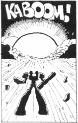
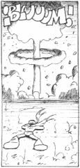
Whoah! Nuclear explosions? At least I
think is more factible for a machine to do that, than for a living creature. I don't put
limits to the MM robots, they are great to draw characters and is fun to write about them.
I like them powerful, fighting, agile and versatile. I like them thinking. And I like them
with emotional and deep inner conflicts!! Psychos? Why not!? However, a single Robot
Master destroying the full Earth is too much. Oo I left that for "Final
Weapons".
More than impose my version (every MM fan
fic author have one) I use these characters to learn how to draw a little faster and test
my skills. I guess MM characters are a good excuse to draw big battles and actions scenes.
That's what I learned with the original games. BTW, is good if you liked the stroyline ^_^
|

16 colors grayscale
60% resampled
|
I know the story was a lot vague in some
aspects, mostly for those non MM fans who could read the comic and didn't understand
anything Oo Sorry. I'll try more explicitly in further comics (heck, that take pages!)
thinking on those who never played the original NES games ... But remember that, at least
in these first four comics, my first goal was to test some techniques and improve my art.
^_^ Maybe I'll try a full color comic someday, don't know.
Conclusion
Well, that's it. You had read enough
crappy! I don't think I'll made another 42 pages comic again (at least online). But yeah,
althought the Fire Man series is over, that doesn't mean comics are over. Guess again!
Until new comics came up I left you a little image problem if you don't have anything else
better to do. =)

16 colors grayscale
70% resampled
|
Comic trivia!
Problem:
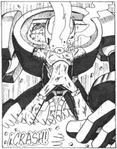
It doesn't care how much cool this image is. It's got a BIG, fatal and silly mistake.
Maybe nodody noted it and I won't tell you what is it. Can you see it?
Hint: It is not a shadow or light source error, and to take a look to the
action before and after this panel may help.
|
Artwork, page design and original
characters, unless noted Copyright � Iv�n Rodr�guez Asqui, IRA
Fire Man and other Mega Man Characters are � & ™ Capcom Entertainment Inc
|
|
